Webflow Box: a clearer structure for agency starter projects
Sima editorial · 11 November 2026 · Analysis · Release announced 13 October 2026
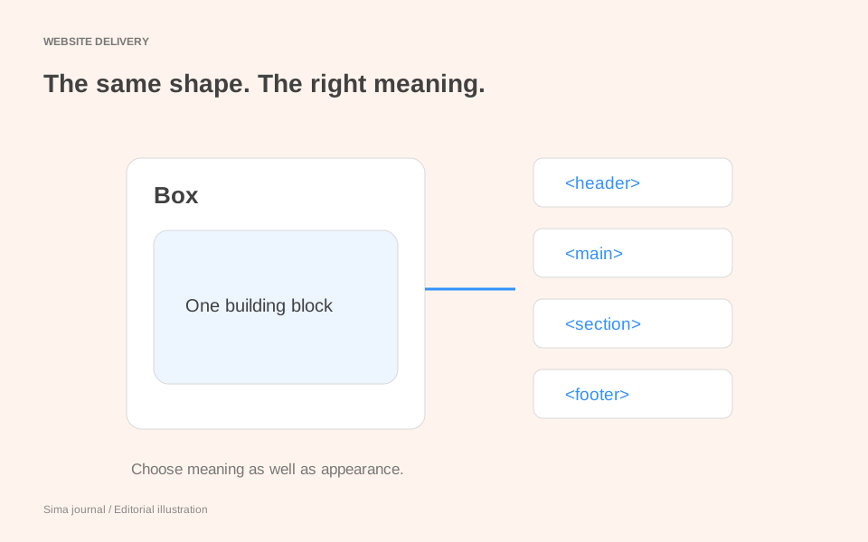
Webflow’s Box element changes how a designer starts building a page: add one structural element, choose what it means, then decide how it lays out its contents. For an agency maintaining a shared starter project, that is an opportunity to make those decisions explicit. A reusable layout should explain both its HTML structure and its visual rules.
Released on 13 October 2026, Box replaces Div Block, Section, Container, Columns, Grid, V Flex and H Flex in the Add panel. The same update adds 19 global tag selectors. Both features are available to users with the Designer role on every plan, including Free, according to Webflow’s announcement.
One element, two decisions
A new Box starts as a div. Its Tag dropdown lives in the Settings panel; its display settings live in the Style panel. Choose section to describe a section of content, then choose Grid if that content needs rows and columns. Choosing the tag does not choose the layout. Quick Find also accepts tag names, so searching for section can insert a Box with that tag already selected. Webflow’s Box guide documents the controls.
This gives starter authors a useful teaching pattern: “add a Box, set its tag, apply the layout class”. It replaces instructions that depend on remembering which older element came with which preset. The agency still needs to supply its own design decisions: content width, page gutters, spacing and responsive behaviour.
A case-study template with readable structure
Imagine an agency’s starter includes a case-study page for a consultancy. It has a site header, a complete project story, a results section and a site footer. A simplified structure could look like this:
<header class="site-header">
  <nav class="primary-navigation">…</nav>
</header>
<main>
  <article class="case-study">
    <header class="case-study-intro">
      <h1>A new home for a growing consultancy</h1>
      <p>Project summary…</p>
    </header>
    <section class="case-study-results">
      <div class="content-width">
        <h2>Results</h2>
        <div class="results-grid">…</div>
      </div>
    </section>
  </article>
</main>
<footer class="site-footer">…</footer>
This is an illustrative document outline, not a Webflow export. The article is a self-contained project story; the section groups its results; the two inner div elements exist to constrain width and arrange content. Webflow’s semantic tag guidance distinguishes these roles and permits a header for either a document or a section.
That second header is particularly useful for teaching the starter. Both headers introduce something, but one might contain a compact logo and navigation while the other contains a large title and summary. Sharing an HTML tag does not mean sharing a component design.
In the Designer, set the corresponding Boxes’ tags, apply content-width to the width wrapper, and set results-grid to Grid. Keep the heading and paragraph as their own content elements. Document the reason for each wrapper alongside its class name: a future maintainer can then tell whether removing a Box would alter meaning, layout, or both.
Global tag styles make that distinction matter
The new selectors act on the HTML tag across the site. All Headers targets header elements, not H1–H6 headings, so it reaches both headers in the example. All Divs reaches the width wrapper, the results grid and other div elements. The new selectors start empty. A class can override a tag style for a property it sets; merely giving an element a class does not isolate it from tag styles. Webflow’s HTML tags documentation explains their scope.
Suppose a designer selects All Headers and sets a dark background, generous padding and a horizontal flex layout while working on the site header. Those choices also become defaults for the case-study introduction wherever its class has not overridden the same properties. The two components now have a relationship that the designer may never have intended.
For this starter, keep those visual decisions on site-header and case-study-intro. Likewise, put the content-width constraint on its named class rather than All Divs. A global structural rule should express something the agency wants for every occurrence of that tag, including occurrences inside components it has not designed yet.
There is another consequence: changing a Box from div to section changes which tag selector matches it. The element can keep its class while gaining or losing defaults. If a semantic correction unexpectedly changes spacing, inspect the tag styles before adding another class override. Otherwise, the starter accumulates exceptions that conceal the original cause.
Give the starter a useful demonstration page
The strongest update to this starter would be a small reference page containing the case-study outline, with both headers visible together. Add a second results section with different content lengths. Show which classes own width, grid layout and component spacing, and record any intentional global structural styles beside the examples.
Use that page to review the template at the widths your agency supports. Then check representative existing pages and shared components, because a tag selector can affect older elements too. The website review checklist provides a wider delivery review; the starter demonstration supplies the specific comparison for this change. When requesting review, follow the website feedback examples and identify the element and unexpected behaviour rather than asking whether the whole template “looks right”.
Existing structural elements remain functional and are not automatically converted to Boxes. A Box set to Div publishes the same output as a Div Block, according to the release note. Adopt the clearer convention for new layouts, and revise existing ones when their structure or maintenance actually warrants it.
Source and scope: documentation-based analysis checked on 8 November 2026. The case study is an invented teaching example; no product-account testing or accessibility compliance assessment was performed.